
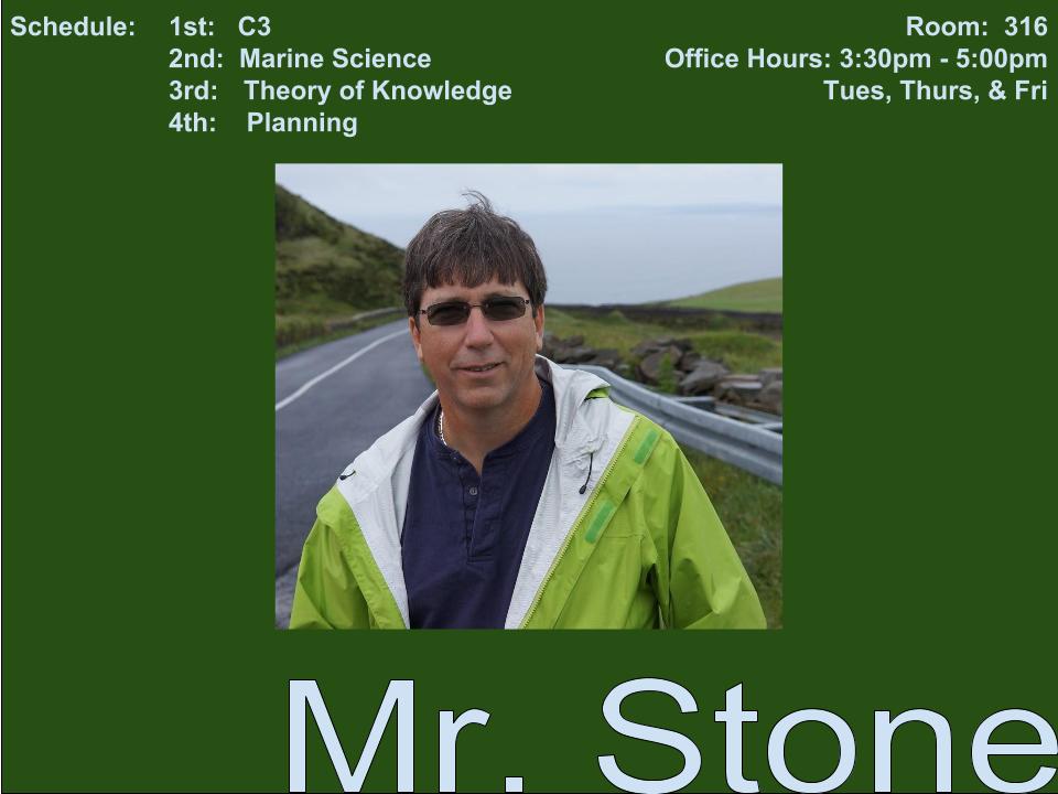
The image that I recreated using adobe photoshop had some graphic space issues. The image was not balanced and the alignment was poor. The graphic space was unorganized and the placement was off. All too often we create images or quick multimedia items, but fail to realize that we need to make it easy for the viewer to read and understand. On the before multimedia image the text seemed as though is was simply placed without a care and it made the image awkward or confusing when looking.
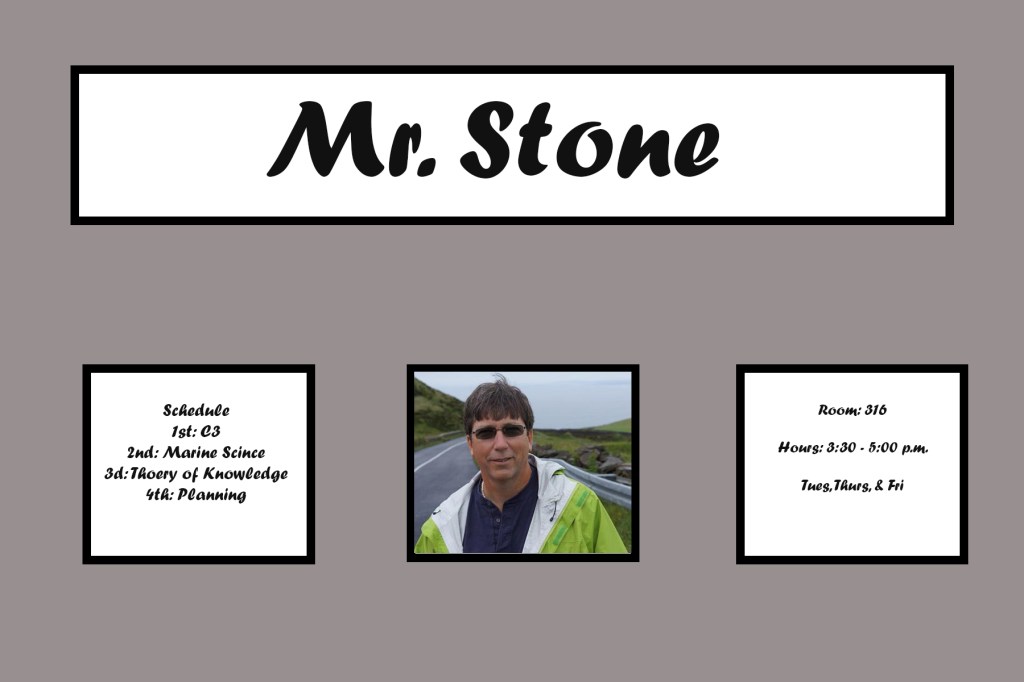
After I recreated the image using photoshop I had to balance out the white space. This was done by using generous margins and using a grid techniques. The grid allows for balance and makes the layout more attractive and pleasing to the eye. Also, incorporating the border draws the eye to the important information.
