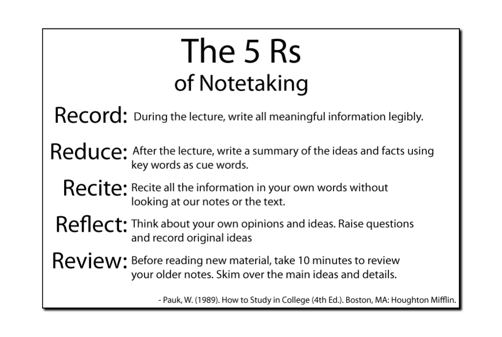

In this assignment the text in an image was analyzed for effective typography. I chose “The 5 Rs of Notetaking”. This image and text lacked purpose, seemed thrown together, and didn’t distinguish the importance of the title from the headings (Rs).
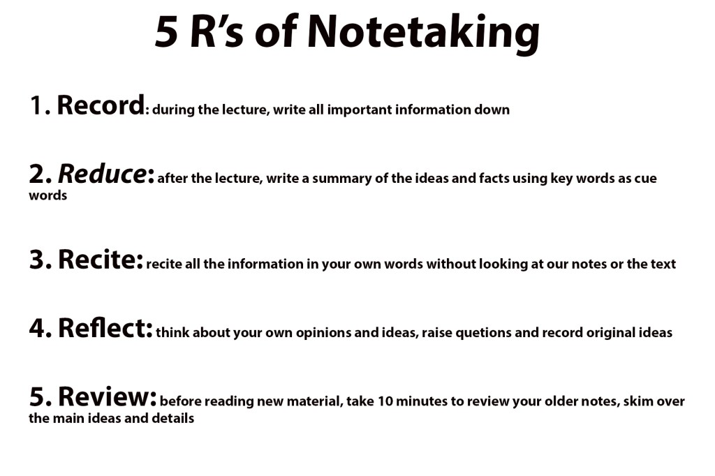
To combat these issues I utilized the font Myraiad Pro for the title along with increasing the size to bring attention. The title is the most important aspect therefore it must stand out. I also chose to number the Rs to give order(sequence) and uniform. Also using another form of the Myraid Pro font for the headings allowed me to bring attention to the headings but not overshine the title. This image and text is easy to read and the main point catches the readers eyes.