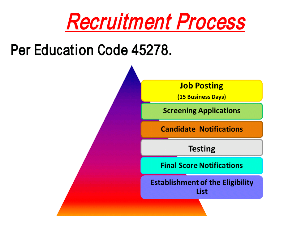

The before visual hierachy multimedia image has a bright large triangle that captures the viewers attention. The bright triangle is not the focal point of the image which means it should not steal the show. The way the information is presented does not show equilibrium in importance.
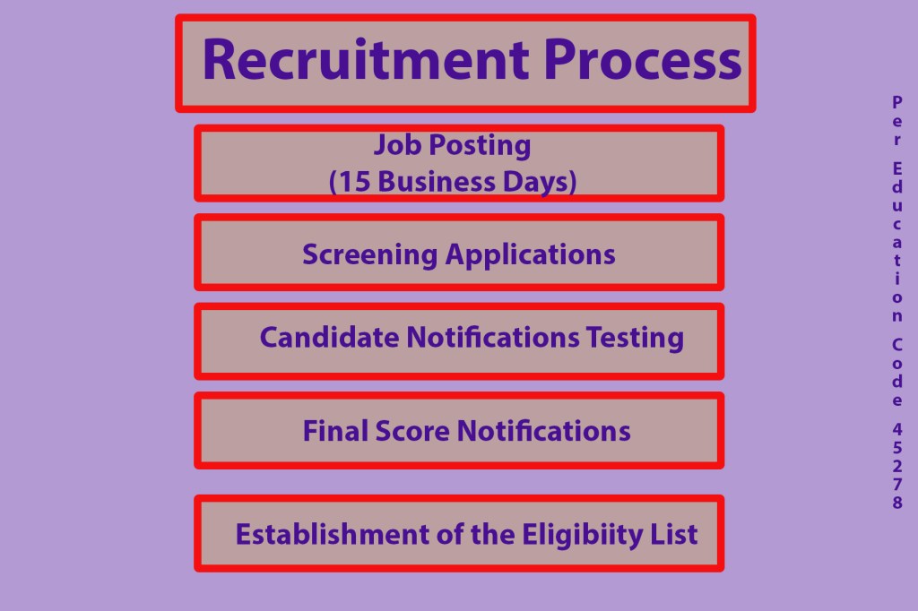
To combat this poor visual hierarchy in this image I took out the over large triangle that stole the viewers attention. Instead I brought size to the title which is the most important aspect. The title is encompassed in a squared shaped text box with a light bright background to grab views attention. All other information is also typed into the same layout text box but the typerface weight is reduced. All other information is the same size and weight to promote equilibrium. The colors and boarders along with the sizes allows for the readers I eyes to be directed in the right way.