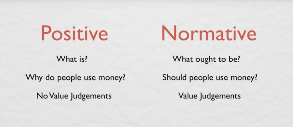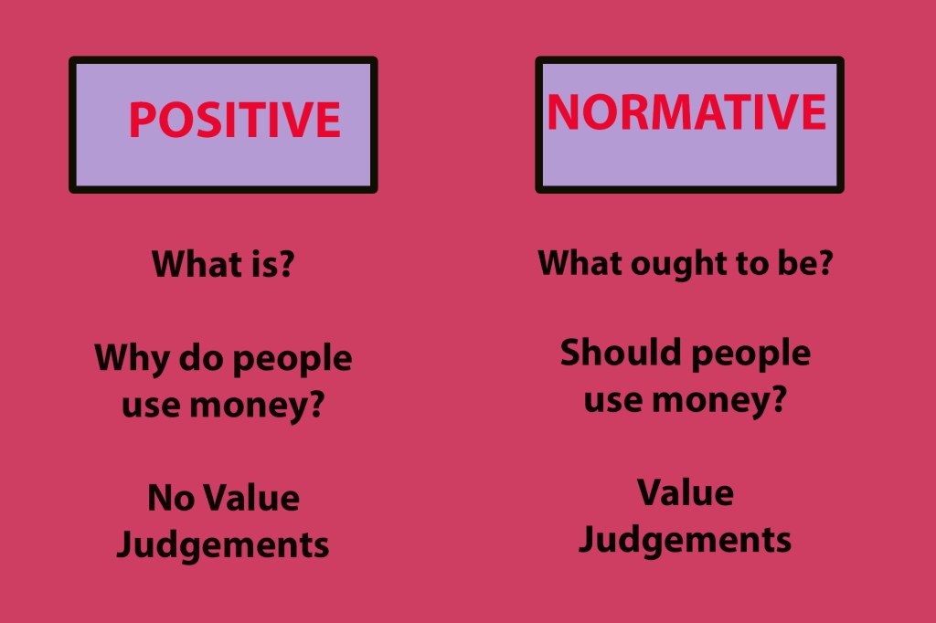

“Contrast is a visual difference that attracts the eye and informs how a person understands a graphic”. The before image lacks appeal to the eye. The colors are dull, lacks texture, and the font/size does not speak volumes. To combat this I change the background from the bland color it had, created boarded text boxes for the headings, and adding colors and different sizes to the font. The after image definitely caters towards towards the contrast principle and draws the eye.